Why Your Paint Colour Never Looks Like the Sample Card (And How to Get It Right)
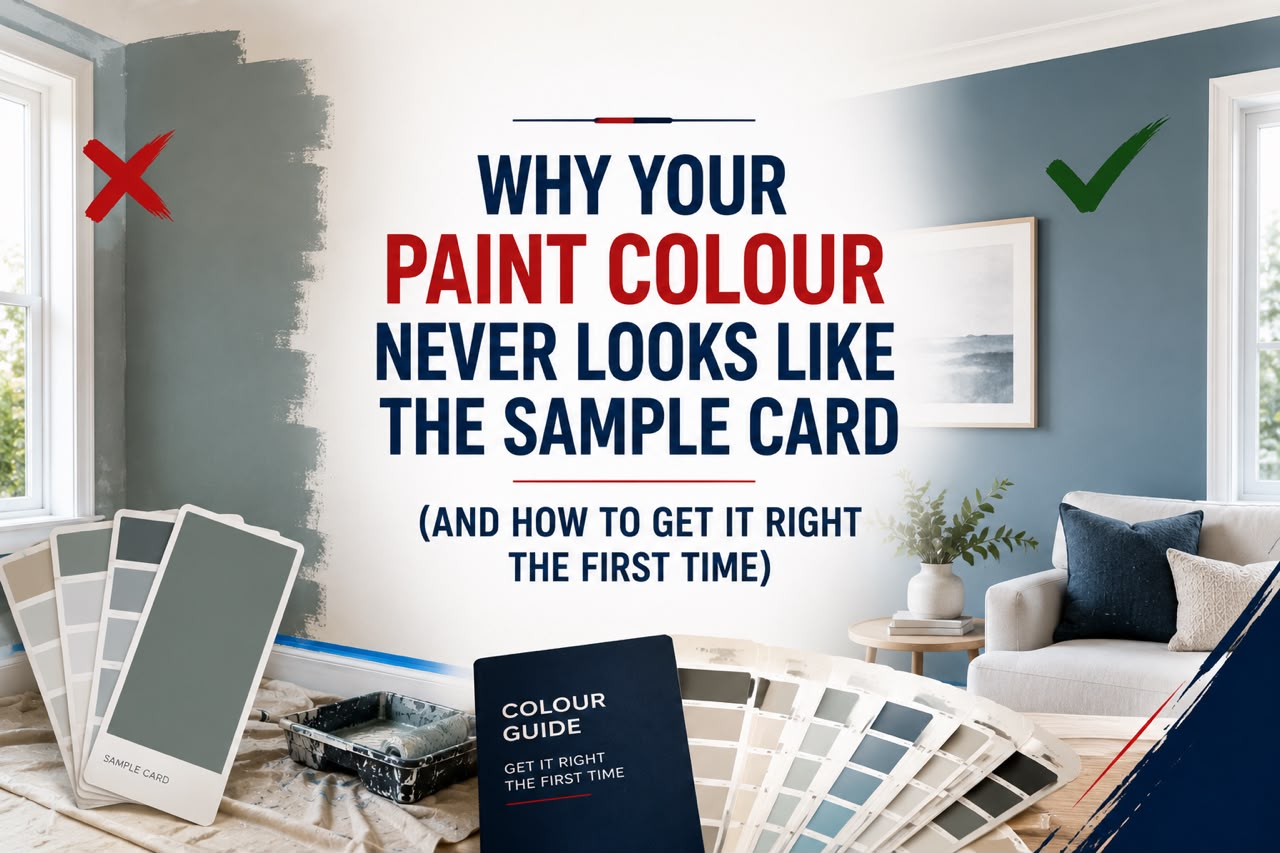
Paint colours look different on walls than on sample cards because of lighting conditions, surrounding surfaces, sheen levels and the way colour perception changes at scale. Understanding these factors before you choose a colour can save you hundreds of dollars in repainting costs and hours of frustration.
You picked the perfect shade. The little rectangle on the card looked warm, sophisticated, and exactly right for your living room. Then you painted the wall, stepped back, and felt that familiar sinking feeling. It’s too dark. Or too purple. Or somehow completely wrong.
This happens to almost everyone, and it’s not because you have bad taste. There are real, predictable reasons why paint colours behave differently on a full wall than they do on a tiny swatch. Once you understand those reasons, choosing the right colour becomes far less stressful and far more reliable.
This guide walks through the most common culprits behind colour mismatch, practical ways to test before you commit, and how professional colour consultancy services can take the guesswork out of the process entirely.
Why Does Paint Colour Look So Different on the Wall?
The Role of Lighting in Colour Perception
Lighting is the single biggest reason a colour can look completely different in your home compared to the paint store. Sample cards are usually viewed under fluorescent retail lighting, which has a very different colour temperature to the natural light in your living room, the warm glow of downlights in your bedroom, or the limited light in a south-facing hallway.
Natural light changes throughout the day too. A colour that looks soft and neutral at 10am can appear quite grey and flat by late afternoon, or pick up a yellow cast in the evening under warm globes. If you’re choosing a colour for a room that you use primarily at night, always look at your samples under artificial light before making a final decision.
The Scale Effect: Why Small Looks Different to Large
Colour perception is heavily influenced by how much of it you see at once. A small chip can look perfectly balanced, but when that same colour covers an entire wall, the saturation and intensity appear much stronger. Deeper colours tend to feel darker and more intense. Lighter colours can look washed out or even white.
This is one of the most underestimated factors in paint selection. Professionals who provide expert paint colour advice account for this effect by recommending slightly lighter or softer versions of a colour when it will be applied across large surfaces.
Undertones You Didn’t Notice
Every paint colour has undertones, and they become far more visible once the colour is on the wall. A beige might read as neutral on the card but pull strongly pink or green when it’s next to your flooring or cabinetry. A grey might look cool and clean on the swatch, then appear distinctly purple in your bathroom.
Sample cards, especially small ones, don’t give you enough context to spot these undertones reliably. They need to be seen alongside the fixed surfaces in your room, such as your flooring, benchtops, furniture, and existing joinery.
Sheen Level Changes Everything
The finish you choose, whether flat, low sheen, satin, or semi-gloss, affects how a colour reads on the wall. A higher sheen reflects more light, which makes colours appear brighter and slightly different in hue. A flat or matt finish absorbs light and makes the same colour look deeper and more muted.
Most sample cards show a single finish, but the paint you apply may be in a different sheen entirely. Always take this into account when testing.
The Influence of Surrounding Colours
Walls don’t exist in isolation. The colours around a painted surface, including ceilings, adjacent walls, furniture, and flooring, all influence how the eye perceives the painted colour. A warm grey on your walls might look almost blue if surrounded by warm timber tones. A soft white can appear creamy next to cool-toned tiles.
This is why professional interior colour consultation involves assessing the whole room, not just the wall you plan to paint.
How to Test Paint Colours Before Committing
Use Large Sample Patches, Not Small Ones
If you’re relying on a small peel-and-stick sample or a single stroke from a tester pot, you’re not giving yourself enough information. Paint a sample area of at least 40cm x 40cm directly on the wall, or use a large sheet of white card stock. Apply two coats so the true colour shows through.
Test the colour on more than one wall in the room, particularly one that receives direct light and one that sits in shadow. The difference can be significant.
Observe the Colour at Different Times of Day
Live with your samples for at least 24 to 48 hours before deciding. Check the colour in the morning, at midday, and in the evening under your artificial lighting. This simple step alone prevents a large proportion of paint colour regrets.
Bring the Room Into the Equation
Hold your samples against your flooring, your upholstery, and any fixed surfaces that won’t be changing. Look for undertones that clash or feel unharmonious. If you can’t put your finger on why something feels off, it’s usually an undertone conflict.
Common Mistakes That Lead to Paint Colour Regret
Choosing colour in the paint store. Store lighting is almost never representative of your home. Always bring samples home before deciding.
Skipping the patch test. The tester pot exists for a reason. Use it, and use it generously.
Choosing colour in isolation. A colour doesn’t live on a wall by itself. It lives alongside everything else in the room.
Relying on digital screens. Screen calibration varies enormously, and colours viewed on a phone or monitor are rarely accurate representations of how a paint will look on a wall.
Going too bold without testing. Deep, saturated colours are beautiful, but they require careful testing because the scale effect is most dramatic with stronger colours.
When to Get Professional Colour Advice
Some people are naturally confident with colour. Many others find it genuinely stressful, and that’s completely understandable. Colour theory is a real discipline, and professionals who work with it every day develop an eye that’s difficult to replicate without experience.
A professional colour consultation is particularly worth considering when:
- You’re renovating and need a cohesive colour scheme across multiple rooms
- You’ve already made a costly mistake and want to avoid repeating it
- You’re working with a difficult space, such as a north-facing room, an open-plan layout, or a home with strong existing architectural features
- You want to increase the appeal of your home before selling
PaintBusters Australia offers an online colour consultancy service that covers expert colour advice for interiors, colour palette development, placement guidance, and product recommendations. Sessions typically run for around an hour and can be booked from anywhere in Australia, which makes it a genuinely convenient option for homeowners who want to get the decision right.
If you prefer a more hands-on approach to your project, the DIY consultancy service from PaintBusters Australia also covers paint selection alongside practical guidance on tools, quantities, and application techniques.
What a Colour Consultant Actually Does
A lot of people assume a colour consultation is just someone telling you which colours are trendy. That’s not quite it. A good colour consultant looks at your space objectively, assessing the lighting conditions, the architectural features, the fixed surfaces, and your personal style preferences. They identify undertones in existing finishes that might influence the new colour, and they recommend specific products based on the result you want.
The value isn’t just in the colour recommendation itself. It’s in the reasoning behind it. When you understand why a colour works in your space, you can apply that thinking to other decisions too, from choosing complementary shades for an accent wall to selecting the right finish for a high-traffic hallway.
For those considering a renovation in an older home, PaintBusters Australia also offers a lead paint test service, which is worth arranging before any sanding or surface preparation begins.
Stop Guessing and Start Choosing with Confidence
Paint colour decisions feel simple until they don’t go to plan. The sample card problem is one of the most common frustrations homeowners face, but it’s also one of the most avoidable. A little more time in the testing phase, a better understanding of how light and scale affect colour, and access to the right professional advice can make an enormous difference.
PaintBusters Australia’s colour consultancy service is available nationwide and is designed to help homeowners, renovators, and DIY enthusiasts make confident, informed choices about colour. If you’d like guidance before your next project, book a consultation through the PaintBusters Australia consultancy services page.
Frequently Asked Questions
Why does paint look different when it dries?
Paint changes appearance as it dries because the water content evaporates, which shifts the light-reflective properties of the surface. Most paints dry slightly darker than they appear when wet. This is another reason patch testing with fully dried coats is so important before committing to a colour.
How many paint samples should I test before choosing a colour?
Testing two to four options in a given colour family is generally a practical approach. More than that can become confusing. Narrow your choices to a shortlist based on the undertone and depth you’re after, then patch test those at home.
Can I get colour advice for both interior and exterior surfaces?
Yes. Professional colour consultants can advise on both interior and exterior colour selection. The considerations differ because exterior colours are viewed in natural light and need to work with the architectural style and surrounding environment, but the core principles around undertones and scale still apply.
Is an online colour consultation as effective as an in-person one?
For most homeowners, yes. Online consultations work well when you provide good quality photos of your space in natural light, alongside images of your flooring, fixed surfaces, and any existing furnishings you plan to keep. Consultants at PaintBusters Australia are experienced at working from photos and can provide specific, actionable recommendations remotely.
How do I choose a paint colour for a room with limited natural light?
Rooms with limited natural light benefit from colours with warm undertones and lighter values. Cool-toned whites and greys tend to look flat and slightly gloomy in low-light spaces. A professional colour consultation is particularly useful in these situations, as the wrong choice can make a challenging room feel even more closed in.
What is the best way to find a cohesive colour scheme for an open-plan home?
Open-plan spaces require colours that work together when viewed from multiple angles simultaneously. The most reliable approach is to start with your largest fixed surface, usually the flooring, and build your palette from there. A colour consultant can help you develop a scheme that flows naturally from room to room without relying on a single repeated colour.